Skinning the Athlete App
A skin is your team's visual identity inside the Skadi's Edge athlete app — its colours, fonts, and background imagery. You build skins from the coach dashboard, preview them live against real app screens, and publish the one you like to every athlete on the team. This guide walks through the whole flow.
Before You Start
App skinning is a Team plan feature. It's included on the Team subscription but not the Personal plan. If the Branding page is locked, upgrade to the Team plan from your team's Subscriptions page. See pricing for details.
- You need a team, and your account must have the Manage Branding permission. The team owner has it by default and can grant it to other staff through their role.
- Everything happens on the Branding page. Open your team, then choose Branding from the sidebar.
- Skins apply to the athlete app only — they don't change the coach dashboard.
Don't want to design anything? Every team starts on the built-in Skadi's Edge — Default skin. You can ignore this page entirely and your athletes get a polished default look.
The Branding Editor
The editor is split in two. The left side is a live preview of your skin running on a phone; the right side is where you edit colours, typography, and images. Every change you make updates the preview instantly.
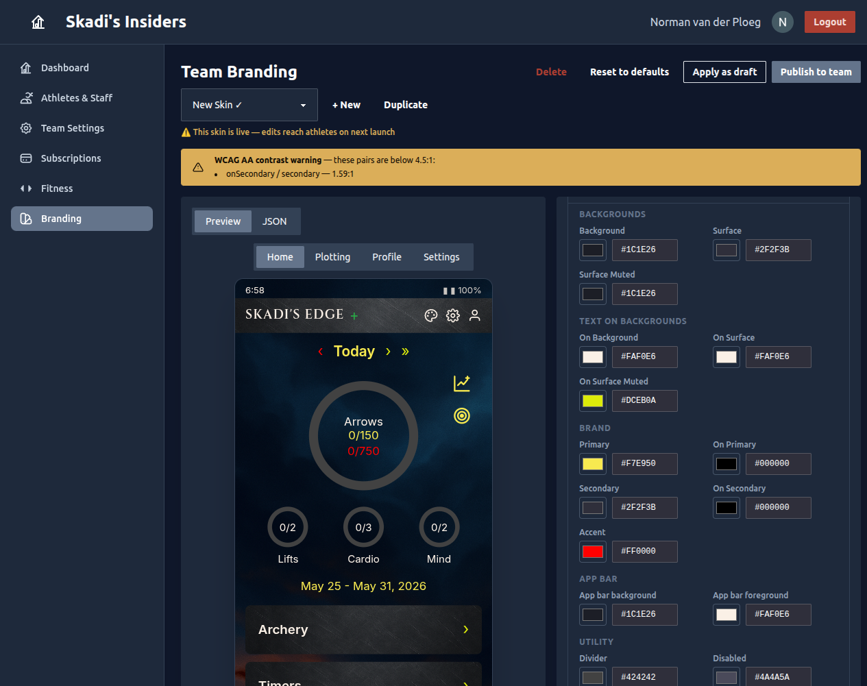
Skins, Drafts & the Published Skin
A team can keep a whole collection of skins and switch between them with the dropdown at the top. Two of them are special:
- Published (marked with a ✓) — the skin every athlete on the team sees. There is exactly one.
- Draft — a skin you've pushed to your own app only, so you can try it on a real device before committing the whole team to it.
Use + New to start a blank skin (a copy of the default), or Duplicate to fork the one you're looking at. Reset to defaults re-forks the current skin's colours and images from the built-in default while keeping its name. The built-in default itself is read-only.
⚠️ Editing the live skin reaches athletes. If the skin you're editing is the published one, the editor warns you — your changes go out to the whole team the next time they open the app. To experiment safely, duplicate it first and edit the copy.
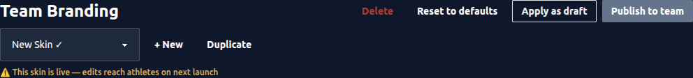
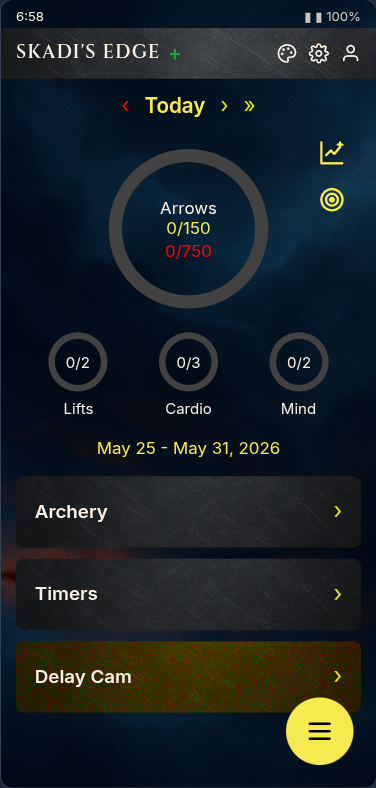
Live Preview
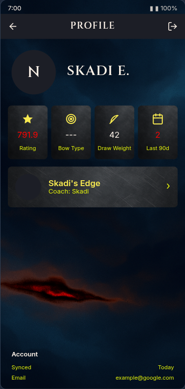
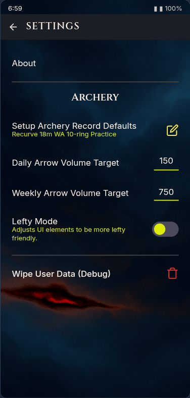
The preview shows your skin across four representative app screens — Home, Plotting, Profile, and Settings — so you can see how every colour and font role behaves in context before publishing.
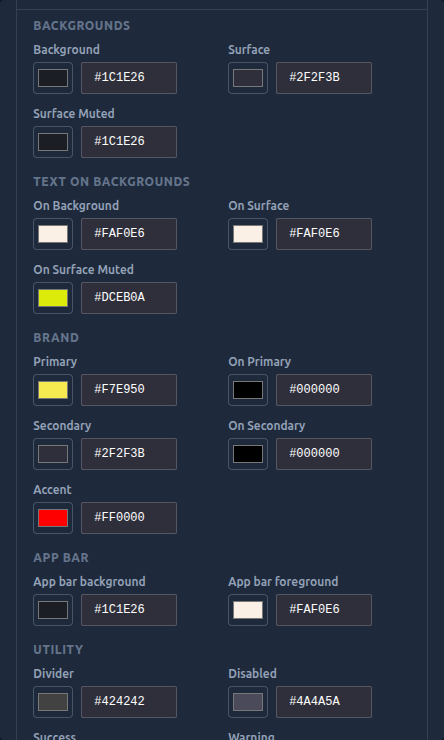
Colours
Colours are defined by role rather than by screen, so a handful of values style the entire app consistently. They're grouped to make sense at a glance:
- Backgrounds — the app background and the surfaces (cards, panels) that sit on top of it.
- Text on backgrounds — the matching "on" colours that text and icons use over each background.
- Brand — your primary and secondary colours, plus an accent used for highlights.
- App bar — the top bar's background and foreground.
- Utility — dividers, disabled states, and the success / warning / danger colours.
Each field takes a colour swatch or a hex value (#RRGGBB). Pair every background with its "on" colour so text stays
readable.
Contrast checking
As you edit, Skadi's Edge checks each text/background pair against the WCAG AA standard (a 4.5:1 ratio). If a combination is too low-contrast to read comfortably, you'll see a warning naming the offending pair — adjust the colours until it clears.

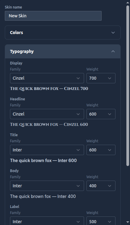
Typography
Fonts are also set by role — Display, Headline, Title, Body, Label, and Numeric (used for scores and counts). For each role you choose a font family from the curated list and a weight, and a live "quick brown fox" sample shows you exactly how it renders.
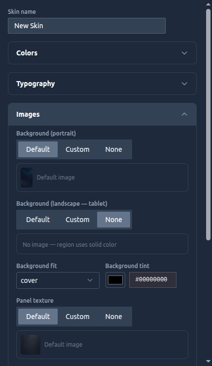
Backgrounds & Textures
Images give a skin its character. Each image slot can be set to Default (the built-in artwork), Custom (upload your own), or None (fall back to a solid colour). You can control:
- Background — separate portrait (phone) and landscape (tablet) images, with a fit mode (cover, contain, or tile) and an optional tint laid over the top.
- Panel texture — a subtle texture behind cards and panels, with a blend mode, plus a separate premium texture variant.
- App bar image — an optional image for the top bar.
Uploaded images are saved to your team's image library, so you can reuse them across skins.
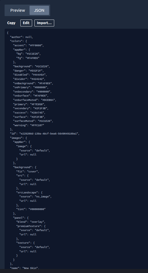
Import & Export
Switch the preview pane to the JSON tab to see the entire skin as a single document. From here you can Copy it, Edit the raw values directly, or Import a skin file someone shared with you. It's the quickest way to clone a look between teams or hand a skin off for tweaking. Imported and edited skins are validated before they're accepted, so a malformed value can't break your app.
Going Live
Your edits are saved automatically as you work. When a skin is ready, you have two ways to ship it:
- Apply as draft — pushes the skin to your app only. Open Skadi's Edge on your phone to see it on a real device. Use Clear draft when you're done previewing.
- Publish to team — makes the skin the team's official look. Every athlete picks it up the next time they open the app.
A typical workflow is: duplicate the current skin, edit it, clear any contrast warnings, apply it as a draft to check it on your phone, then publish it to the team.
Need Help?
- Don't see the Branding page? Ask your team owner to grant you the Manage Branding permission.
- Athletes not seeing a new skin? It's applied on their next app launch — ask them to fully reopen the app.
- Contact support if something doesn't look right.